 Learning how to build professional dashboards in Excel gives you a clear way to track, display, and understand your business data. A good dashboard helps you make decisions faster by showing what matters most. It also gives your team a shared view of performance.
However, building one that actually works takes planning. You can’t just drop in a few charts and hope it helps. Instead, you need to think about who will use it and what they need to know. Additionally, your dashboard must be easy to read and quick to update. Therefore, start with the basics. Define the purpose. Organize your data. Then build around the questions your users need answered. This approach keeps things focused and prevents confusion. Additionally, it saves time during updates and revisions.
Many dashboards fail because they include too much. You should avoid overloading your layout with numbers or charts. Simplicity and clarity work best. That way, your users can take action without guessing what the data means. Excel gives you plenty of tools to work with. You can use tables, formulas, charts, and controls to make your dashboard dynamic. However, just because a feature exists doesn’t mean it belongs. Use only what supports your purpose.
Therefore, before you start formatting, make a plan. Think about the problem you want to solve. Then decide what your dashboard needs to show. If you do that first, your design will make more sense. And your dashboard will work better for everyone who uses it.
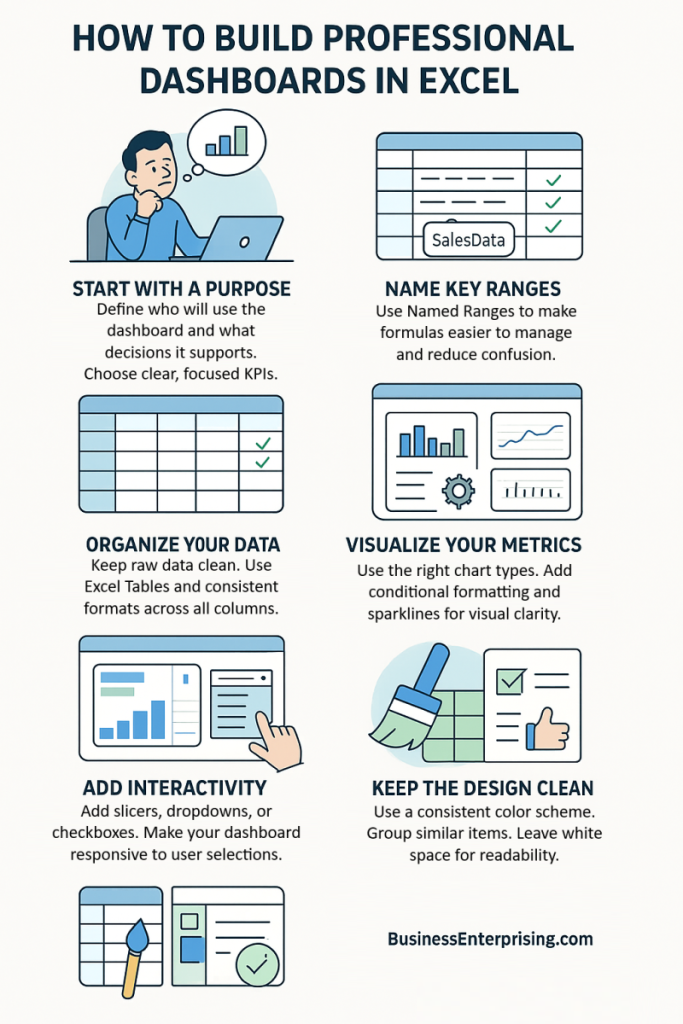
Define the Purpose and Audience of Your Dashboard
Before you start building any dashboard, you need to know who will use it and what they need from it. Every dashboard should solve a specific problem or support a particular decision. Without a clear purpose, the dashboard can become cluttered and confusing.
Start by identifying the primary users. Are they executives, managers, or team leads? Each group cares about different data. Executives often want high-level trends. Managers might need daily or weekly performance metrics. Therefore, your dashboard design should reflect these differences.
Next, define the decision-making context. What questions should your dashboard answer? Additionally, what actions might follow after reviewing the data? For example, if the dashboard tracks sales, it should help users spot dips, trends, or performance gaps. Then, decide on the key performance indicators. You should only include metrics that relate to the purpose of the dashboard. Too many metrics can overwhelm the user. However, too few might miss important insights. Therefore, choose KPIs that are relevant, timely, and measurable.
Clarity starts with intent. If you know what your users care about, your dashboard will stay focused and useful. This step is the foundation for how to build professional dashboards that actually serve a function. It’s not about showing off every data point. It’s about showing the right ones at the right time. Additionally, always think about how the data will be used. Will someone use it to report up the chain or to adjust day-to-day tactics? Keeping this in mind helps you frame the layout and choose the right visuals.
Structure Your Data for Dashboard Use
Before designing your dashboard, you need clean, organized data. Without a solid data structure, your dashboard won’t work well. The way you store and manage your data directly affects how smoothly the dashboard operates.
Start by keeping your raw data in a separate sheet. Then, convert your data into Excel Tables. Tables automatically expand when you add new entries. Therefore, formulas and charts update without extra effort. Additionally, they make referencing easier when writing formulas. Next, use named ranges for important data sets. Named ranges make your formulas more readable and easier to manage. For example, instead of using cell references, you can refer to something like SalesData or RegionList. This helps reduce errors, especially as your workbook grows.
Data validation is also worth using. It allows you to control inputs by limiting what users can enter. For instance, you can create dropdown lists to keep entries consistent. That consistency helps prevent formula errors and chart display issues. Additionally, avoid mixing data types in the same column. Keep dates, text, and numbers in their proper places. If you need labels, use a separate column instead of combining them with values.
These steps may seem basic, but they make a big difference. Structured data sets the stage for performance and clarity. Therefore, if you want to know how to build professional dashboards, start with your data. Organize it well, and the dashboard will be easier to build and maintain. Finally, double-check that your data is up to date. Clean data supports better insights, which means faster and more confident decisions.
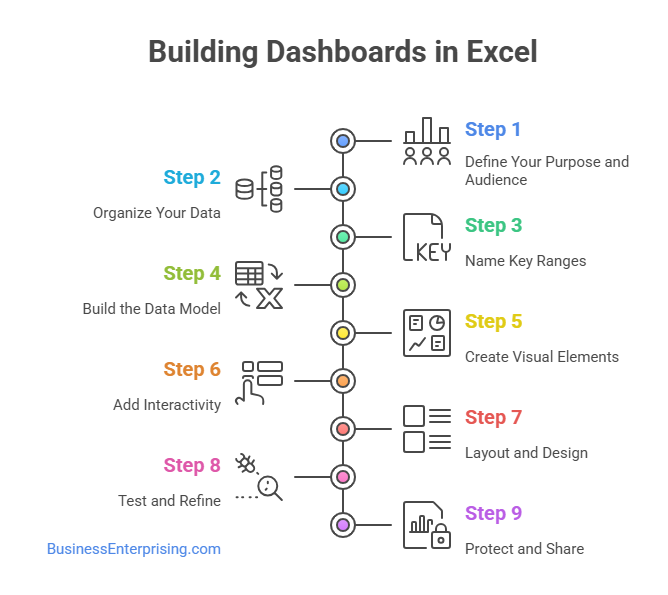
Use Excel Functions for Dynamic Insights
If you want your dashboard to respond to inputs and updates, then you need the right Excel functions. These formulas help you pull and shape your data in real time. With them, your dashboard becomes more than just a static report.
Start with the SUMIFS function. It allows you to total values based on multiple conditions. For example, you can sum sales for a region and product type. Therefore, it’s great for tracking performance by category. Additionally, use INDEX and MATCH together to look up values based on dynamic input. INDEX returns a value from a range, while MATCH finds the correct position. This combination is more flexible than VLOOKUP, especially when columns move.
The IF function is also important. It allows you to build logic into your data model. For instance, you can show a message when data is missing. Or flag numbers above a certain threshold. That flexibility adds meaning to your reports. For filtering results without changing your dataset, use the FILTER function. It pulls a subset of your data based on set rules. Therefore, it works well for building dropdown-driven dashboards or reports.
Additionally, all of these functions can be combined to form more complex models. That’s how you make your dashboard truly interactive. You get the right data, at the right time, based on the right inputs. If you’re learning how to build professional dashboards, mastering these formulas is essential. They give your dashboards power, speed, and relevance. Build your formula skills, and your dashboards will work harder for you.
Design with Clarity and Usability in Mind
A well-designed dashboard makes data easier to read and faster to understand. You don’t need to use every inch of space. Instead, focus on simplicity. A clean layout helps your users find what matters without distraction or confusion.
Start with a clear structure. Group related charts and tables together. Use white space to separate sections and guide the eye. This keeps the dashboard from feeling crowded. Additionally, keep titles short and direct. Every element should serve a purpose. Color also matters. Use a consistent color scheme throughout your dashboard. Choose no more than three or four main colors. Reserve bright colors for key highlights. That way, important data stands out without overwhelming everything else.
Additionally, avoid using too many chart types. Stick to visuals that match the data being shown. Bar charts, line charts, and gauges often work best. Keep your legends and labels simple. If your user needs to guess what something means, it doesn’t belong there. Therefore, test your dashboard with a fresh set of eyes. Ask someone else to interpret it without your help. If they get confused, simplify the layout or remove extra elements.
Learning how to build professional dashboards isn’t just about formulas and features. It’s also about communication. Good design supports clear thinking and better decisions. You want the data to speak for itself without noise or clutter. Finally, always keep usability in mind. Design for the person reading the dashboard, not for yourself. If it’s easy to use, it will be used more often.

Incorporate Visual Elements Effectively
Visuals help your data tell a clear story. Charts, formatting, and small graphics can show trends faster than numbers alone. However, they must be used with purpose. Too many visuals can confuse your reader instead of helping them.
Start with charts that match your message. Use bar charts to compare categories. Use line charts to track performance over time. Additionally, combo charts work well when you need to show two related metrics. Avoid using 3D effects or unnecessary decorations. They make charts harder to read. Conditional formatting is useful for highlighting key values. For example, you can use colors to flag low inventory or missed targets. Therefore, you draw attention without adding extra columns or charts. Additionally, it makes patterns easier to spot at a glance.
Sparklines can show trends in a compact way. You can place them inside cells next to your data. That saves space while still adding insight. However, use them for supporting information only, not your main message. Slicers add interactivity. They let users filter data in real time without using complex menus. Therefore, slicers work well with pivot tables and help your dashboard feel more flexible. Additionally, you can connect them to multiple charts at once.
Learning how to build professional dashboards means knowing when to use visuals and when to hold back. Each chart or element should serve a clear function. Your goal is to help the reader understand the data quickly and accurately. Keep it clean, simple, and focused on the story the numbers are telling.
Add Interactivity with Form Controls and Pivot Tables
Interactivity makes your dashboard easier to use and more useful. When users can adjust inputs, they get answers faster. Adding basic controls like dropdowns or checkboxes lets your dashboard respond to what the user needs.
Start with dropdown menus. You can create these using form controls or data validation. Connect them to dynamic ranges or formulas. Therefore, when someone selects an option, your charts or tables update automatically. This works well for filtering by region, product, or date. Additionally, checkboxes can drive simple yes-or-no logic. For example, you can let users choose whether to include certain metrics. Tie these to helper cells and link them to formulas or visibility rules. That makes your dashboard feel responsive without being complex.
Pivot tables also play a major role. They organize large amounts of data and can summarize results quickly. When linked to slicers, they allow users to click through categories or time periods. Therefore, you can create an interactive report without writing new formulas. Slicers connect directly to pivot tables. They act like visual filters. Users click a button, and the data changes. Additionally, slicers can be synced across multiple visuals. That means one filter can control several charts at once.
If you’re learning how to build professional dashboards, adding interactivity is an important step. It gives users control without needing to edit the workbook. Therefore, dashboards become easier to explore and more useful over time. Keep the controls simple, clean, and focused on what matters most to the user.
Conclusion
Building a dashboard takes more than just adding charts to a spreadsheet. It requires thought, structure, and user-focused design. You need to plan each section with care. A dashboard should answer real questions, not just display data.
Therefore, start with a clear purpose. Then organize your data before jumping into layout and visuals. Each decision affects how useful your dashboard becomes. Additionally, remember that design and function go hand in hand. A clean look helps people focus on what matters.
Use tools that support flexibility and ease of use. Excel gives you features like formulas, pivot tables, and form controls. However, the value comes from how you put them together. When done right, your dashboard works almost like a live report. Additionally, think about how others will use it. A dashboard should guide users without training or guesswork. Use consistent styles, readable fonts, and meaningful labels. Therefore, your work becomes more than just a report. It becomes a tool that drives better decisions.
If you’re learning how to build professional dashboards, remember to keep things simple. Fancy features don’t matter if the data feels confusing. Focus on usefulness first, then improve the visual design. Your goal is to make information easier to understand and faster to act on. Keep practicing, test your layouts, and ask for feedback. That’s how your dashboards improve over time. Good dashboards do more than present numbers. They help your team see what’s working and what needs attention.