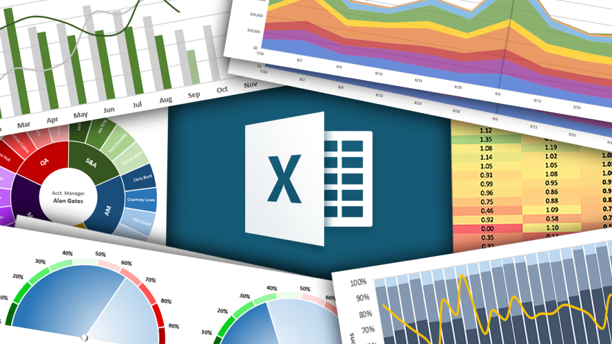
 Visualizing data effectively is an essential skill for anyone working with numbers. Data visualization in Excel offers a straightforward way to present insights clearly. By creating charts and graphs, you can simplify complex datasets and make information more accessible.
Additionally, Excel provides a range of tools to turn raw data into professional visuals. With the right techniques, you can highlight trends, identify patterns, and communicate your findings effectively. However, understanding how to choose and customize charts is key to creating visuals that stand out.
Whether you’re analyzing sales, tracking performance, or presenting metrics, Excel’s features help you create visuals tailored to your needs. This guide will walk you through the steps to create clear, engaging charts and graphs that enhance your data analysis.
Why Data Visualization Matters in Business
Data visualization plays a key role in transforming raw data into meaningful insights. It allows you to quickly interpret complex information and identify patterns. With clear visuals, trends and relationships become more apparent, helping you make informed decisions with confidence. Data that remains in spreadsheets can often feel overwhelming, but charts and graphs can simplify even the most complicated datasets.
Using data visualization in Excel is an effective way to communicate your findings. Visuals like bar charts or scatter plots make it easier to share data insights with your team or clients. When data is presented visually, it tells a story that words and numbers alone cannot. Additionally, well-designed charts help highlight key points, ensuring your message resonates clearly and effectively.
Effective decision-making relies on understanding data at a glance. With Excel, you can create dynamic visuals that summarize essential metrics, making them accessible to anyone. Furthermore, visuals improve communication by bridging the gap between technical and non-technical audiences. When everyone understands the data, collaboration improves, and outcomes become more aligned with goals.
By turning raw numbers into actionable visuals, you streamline your workflow and add clarity to your data analysis. Well-crafted charts and graphs provide a foundation for better conversations and more productive meetings.
Getting Started: Excel’s Chart and Graph Tools
Getting started with Excel’s chart and graph tools is straightforward and rewarding. Excel offers a variety of built-in features to create clear and engaging visuals. You can choose from bar charts, line graphs, scatter plots, and more, depending on your data and purpose. These tools allow you to bring raw data to life, making it easier to identify trends and communicate your insights.
When working with data visualization in Excel, selecting the right chart type is essential. Different charts serve different purposes, so consider what you want to convey. For example, bar charts work well for comparisons, while line graphs highlight trends over time. Additionally, pie charts are ideal for displaying proportions. Think about your audience and the message you want to deliver before making a choice.
Excel’s customization options make your charts even more effective. You can adjust colors, add labels, and use styles to match your presentation’s tone. However, it’s important to avoid clutter and keep the design simple. A clear, focused chart helps your audience grasp your message quickly and makes your data stand out.
By exploring Excel’s chart and graph tools, you’ll gain the ability to present your data with clarity and precision. These features make it easier to turn numbers into visuals that drive better understanding and decisions.
Step-by-Step Guide to Creating Common Charts
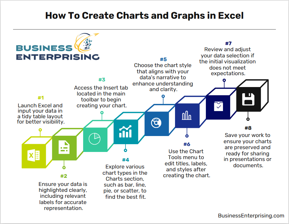
Creating common charts in Excel is an easy way to improve how you present data. Bar charts are one of the simplest and most effective options. To create a bar chart, select your data, go to the “Insert” tab, and choose the bar chart option. Bar charts are ideal for comparing categories, such as sales across different regions. They make it easy to spot differences and focus on key areas of interest.
Line charts are another useful option for data visualization in Excel, especially when showing trends over time. For example, a line chart can track monthly revenue or changes in website traffic. To create one, highlight your data, navigate to the “Insert” tab, and pick the line chart. Line charts work well for emphasizing growth or decline and are particularly effective for forecasting.
Pie charts are perfect for displaying proportions within a dataset. These charts are best suited for data that adds up to a whole, like market share percentages. Select your data, then use the “Insert” tab to choose the pie chart. However, be mindful of using too many slices, as this can confuse your audience. Keep it simple to enhance clarity.
Scatter plots are excellent for showing relationships between two variables. For example, you might use one to highlight the correlation between advertising spend and sales. To create a scatter plot, select your data, go to “Insert,” and choose the scatter plot option. These charts provide a clear view of how two factors interact and help you identify trends or outliers.
With these tools, you can turn raw numbers into insights that are easy to understand and share. By using the right chart type, your data becomes more engaging and actionable.
Advanced Features for Professional Visualizations
Excel’s advanced features can take your charts to the next level, making your data more engaging and professional. Customizing colors and styles helps match your visualizations to your brand or presentation theme. To do this, select your chart, then adjust the design options under the “Format” or “Chart Design” tabs. Additionally, adding or modifying data labels makes your charts easier to read by displaying specific values directly on the graph.
Combo charts are a powerful option when working with data visualization in Excel. These charts combine two types of graphs, such as a bar chart and a line graph, on the same axis. They are ideal for comparing two datasets with different measurement scales, like sales revenue and unit quantities. You can create a combo chart under the “Insert” tab by selecting “Combo Chart” and customizing the data series.
Sparklines and trendlines are also valuable for visualizing data. Sparklines are mini-charts that fit into a single cell, summarizing data trends in a compact form. You can create sparklines by selecting your data, going to the “Insert” tab, and choosing the sparklines option. Meanwhile, trendlines add a visual representation of trends over time or within data patterns. To add a trendline, right-click on a data series and choose “Add Trendline.” This feature is particularly helpful for identifying growth, decline, or consistent trends.
By leveraging these advanced features, you can create polished and informative charts that make a strong impression. Customization options and innovative tools like combo charts and sparklines allow you to present data in a way that’s both effective and visually appealing.

Tips for Effective and Engaging Data Visualization
Effective data visualization focuses on clarity and simplicity, helping your audience quickly understand your insights. When designing charts, keep your visuals clean and focused. Use consistent colors and simple fonts to avoid distractions. Additionally, always choose the right chart type for your data, as mismatched visuals can confuse your message.
Storytelling is an important part of data visualization in Excel. A well-structured chart should guide your audience through the key takeaways. Highlighting trends, comparisons, or relationships within the data makes it easier to communicate your point. For example, emphasizing key data points with contrasting colors can draw attention to important insights.
Avoid common pitfalls that reduce the effectiveness of your charts. Overloading visuals with too much information can make them difficult to read. Therefore, remove unnecessary elements like gridlines or excessive text. Additionally, misleading scales or inconsistent intervals can distort your data and undermine your credibility. Always check your axes and ensure they reflect the data accurately.
By following these tips, you can create visualizations that are both engaging and informative. Simple, clear, and purposeful designs make it easier for your audience to connect with your message and act on your findings.
Real-World Applications and Use Cases
Data visualization in Excel offers businesses practical ways to manage and present important information. For sales teams, charts can track revenue trends, identify top-performing products, or compare monthly sales across regions. By using line charts or bar graphs, you can quickly highlight patterns and share actionable insights with your team.
Financial analysis is another common use case. With Excel charts, you can monitor expenses, revenue, and profit margins over time. Pie charts work well to show budget allocations, while scatter plots can identify correlations between variables, such as cost and performance. Additionally, project managers can use Gantt charts or timelines to track milestones, deadlines, and progress in a visually clear format.
Sharing and presenting these visuals professionally is just as important as creating them. Therefore, always customize your charts to suit your audience. Use clear labels, consistent colors, and well-organized layouts to make your message easy to follow. Additionally, you can embed charts into PowerPoint presentations or reports for seamless delivery during meetings.
When applied effectively, Excel charts enhance collaboration and decision-making. Whether you are presenting performance metrics to stakeholders or managing daily operations, professional charts simplify communication and keep everyone focused on the data that matters most.
Conclusion
Data visualization in Excel provides a powerful way to analyze and communicate your data. By turning numbers into clear visuals, you can make complex information easier to understand. Additionally, using the right charts and advanced tools helps you highlight key insights and guide better decisions.
However, creating effective charts requires thoughtful design and simplicity. Choosing the right chart type, customizing visuals, and avoiding clutter are essential steps. When done well, your visuals will tell a story that resonates with your audience.
Whether you’re analyzing sales, managing projects, or presenting metrics, Excel charts offer flexibility and impact. With these tools, you can share your findings in a way that is both professional and easy to understand. By applying best practices, you’ll create visuals that support your goals and improve communication.