 The layout of your retail store does more than organize shelves. It shapes how customers move, shop, and make decisions. Smart retail store layout tips can help guide traffic, boost sales, and improve your store’s overall experience. Your goal should be to design a space that feels natural and easy to shop.
Additionally, your layout should reflect customer behavior and business goals. People often follow patterns when they enter a space. Therefore, it helps to arrange your store in a way that supports those habits. You want to make it easy for shoppers to see more, not less.
However, layout isn’t just about flow. It also affects how long customers stay and how much they spend. With the right setup, even a small space can feel inviting and profitable. Additionally, you should update the layout regularly based on performance and product changes.
Therefore, think about how each area of your store works together. From entrance to checkout, every zone matters. Pay attention to display height, traffic flow, and product placement. Small layout changes can lead to big results when done with purpose.
By applying layout strategies that reflect how people really shop, you’ll create a more effective retail environment. Keep testing, keep learning, and adjust as needed. That approach builds a space that supports both sales and satisfaction.
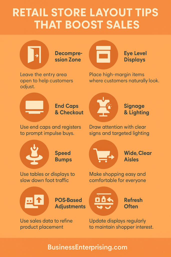
Understanding the Power of the Decompression Zone
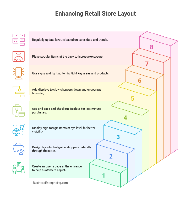
When a customer enters your store, the first few feet matter more than you might think. This area, called the decompression zone, helps shoppers transition from the outside world into a buying mindset. It usually spans the first 5 to 15 feet inside your entrance. During this time, people adjust to lighting, temperature, and your store’s atmosphere. They’re not yet focused on products or promotions.
Because of that, it’s best not to place anything important in this space. Shoppers tend to overlook signs, displays, or shopping carts placed here. You might think a flashy sale sign at the entrance grabs attention, but it often goes unnoticed. Instead, use this space to create a welcoming environment. Keep it open, clean, and easy to pass through. This clears the path for a smoother shopping experience.
Additionally, the decompression zone can influence how people view your entire store. If it feels cluttered or confusing, customers may feel rushed or distracted. Therefore, use neutral colors and subtle lighting in this area to help calm the senses. Avoid placing complex merchandise displays here. Save those for the areas that follow, where attention and buying intent increase.
When it comes to retail store layout tips, this concept gets overlooked often. However, smart use of your entry space can set the tone for better browsing and higher sales. Think of this zone as a reset button for your customers. By giving them space to adjust, you increase the odds they’ll shop longer and buy more.
Designing a Natural Flow That Matches Customer Behavior
Most shoppers turn right after entering a store. This is known as the right turn bias. It’s a common habit that smart retailers use to their advantage. You can design your store to follow this natural behavior. When you guide traffic in a way that feels easy, customers stay longer and shop more.
Therefore, it helps to use a layout that matches your store’s size and product type. A grid layout works well for stores with lots of inventory. It creates clear aisles and supports product organization. However, this setup can feel rigid if not softened with displays or signs. Loop layouts, on the other hand, guide shoppers along a set path. This layout makes sure they pass by most merchandise. Additionally, a loop layout gives you space to feature key products at corners or turns.
If you want a more casual flow, a free-flow layout offers flexibility. This style lets shoppers move at their own pace. However, it requires thoughtful product placement so people don’t miss important sections. You should test different setups to see what encourages more browsing and longer visits.
Additionally, you want to place high-demand items toward the back. That way, customers pass other products along the way. This method increases exposure and can raise the average sale. Retail store layout tips often mention this, but many stores ignore it. Therefore, consider how your layout matches customer behavior. Use design to lead shoppers where you want them to go. With a thoughtful plan, you’ll guide traffic naturally and sell more.

Strategic Product Placement and Focal Points
Where you place products has a big impact on how much customers spend. Certain locations catch more attention and trigger quick decisions. Eye-level shelves are some of the most valuable spots in your store. People naturally scan at this height, so it’s ideal for high-margin or new items.
Additionally, end caps work well for promotions or impulse buys. These displays grab attention without taking up much space. You can change them often to feature seasonal products or slow movers. However, make sure the presentation stays clean and easy to browse. Messy displays can reduce their impact.
Another overlooked area is the checkout zone. While customers wait in line, they often pick up last-minute items. Therefore, you should stock this area with low-cost goods that don’t need much thought. Think snacks, accessories, or trial-size items. These choices can raise your average ticket without needing more foot traffic.
When considering retail store layout tips, focus on your most valuable spaces. Products in high-traffic spots should earn their place. Additionally, keep pricing and signage simple so customers act quickly. Clear communication leads to more spontaneous purchases.
Therefore, walk your store as if you’re a customer. Look for areas where people pause, glance, or wait. Use these moments to present products that add value to the sale. Smart placement doesn’t require more inventory. It just makes the most of your existing floor space.
Creating Visual Breaks with Speed Bumps
Many shoppers move quickly through a store without noticing much. To counter this, you need ways to slow them down. That’s where speed bumps come in. These are small visual interruptions that make people pause and look around. Display tables or themed groupings often work best for this purpose.
Additionally, speed bumps help break up long aisles or open spaces. Without them, people may pass by products without a second glance. Therefore, you should use them to feature new items, seasonal collections, or limited-time deals. This draws attention without overwhelming the space.
Cross-merchandising is another smart tactic. For example, place related products together in one display. This could be coffee mugs next to gourmet beans or candles near bath products. When customers see items that fit together, they’re more likely to buy both. This setup makes shopping feel easier and more natural.
When looking for practical retail store layout tips, speed bumps often get overlooked. However, they can create natural breaks in the shopping flow. Additionally, they give your staff room to showcase creativity and respond to trends. These small shifts can have a big impact on shopper behavior.
Therefore, think about how you want people to move through your store. Add points that stop their stride without blocking the path. The goal is to spark curiosity and encourage more time spent browsing. Slower traffic often leads to more sales.
Using Signage and Lighting to Influence Buying Decisions
Signage and lighting do more than make your store look nice. They guide attention, support your brand, and influence buying decisions. Directional signs help shoppers move easily from one section to another. Without them, people may feel confused or frustrated.
Additionally, shelf tags offer key information at the right moment. These small signs highlight price, features, or special offers. When used correctly, they make decisions faster and smoother. Therefore, avoid cluttered or outdated tags. Keep the message clear and easy to read.
Lighting plays a big role in how products are viewed. Bright lighting works well for open spaces and general browsing. However, targeted lighting helps feature specific items or displays. You can use it to highlight new arrivals or premium merchandise. This draws focus without saying a word.
Additionally, lighting can shape the mood of your store. Warm lighting feels relaxed and welcoming. Cooler lighting feels clean and modern. Choose the tone that fits your brand best. When used together, signs and lighting guide both eyes and feet through the space.
Retail store layout tips often skip over the details of signage and lighting. However, these tools work quietly in the background to drive sales. Therefore, take time to review how these elements function in your store. Simple updates in wording or bulb placement can change how people shop.
Use signs to speak clearly and lights to lead the way. Together, they support the flow and feel of the entire shopping experience.
Adapting Layouts Based on Data and Seasonality
Your store layout shouldn’t stay the same all year. Customer behavior shifts, and your setup should reflect those changes. Seasonal trends affect what people buy, how they shop, and how long they stay. Therefore, it makes sense to update displays and traffic flow as the seasons change.
Additionally, your POS data can help guide these decisions. You can see which products sell well and which get ignored. This gives you clear insight into what to highlight next. If certain items spike during specific months, place them in key areas early. This increases visibility and gives them more time to move.
However, don’t just look at what sells. Pay attention to what sits untouched. Products with low turnover may need better placement or a stronger visual push. Therefore, rotate inventory and refresh displays often. Even a small change in location can make a big difference.
Retail store layout tips often focus on structure but ignore timing. You need to blend layout planning with regular updates. Additionally, move seasonal items closer to the front where they’re easier to see. This reminds customers of what’s current and keeps the store feeling fresh.
Data helps you make smarter decisions instead of guessing what might work. Combine that with seasonal awareness, and your layout starts working harder for you. Use this strategy to create a store that adjusts with your customers’ needs.
Conclusion
The way you design your store has a direct effect on sales. A thoughtful layout supports both shopper comfort and business goals. Each section of your store can guide behavior, trigger interest, and boost spending. However, the layout must stay flexible and responsive to change.
Therefore, pay attention to how people move, pause, and buy. Use that insight to place products where they’ll be noticed. Additionally, watch how seasonal shifts affect foot traffic and buying habits. You don’t need to redesign everything at once. Small adjustments over time can lead to steady gains.
Retail store layout tips work best when applied with consistency. That means reviewing results and making changes as needed. Your store is not static, and your layout shouldn’t be either. Additionally, involve your staff in spotting what works and what doesn’t. They see shopper behavior up close every day.
The best layouts strike a balance between structure and flexibility. You create a path, but leave room for discovery. Shoppers like to explore when it feels natural. Therefore, give them reasons to slow down, look around, and stay longer. Simple tools like lighting, signage, and placement can guide that process. Keep testing, keep adjusting, and let your store tell you what needs work. Over time, your layout will do more than just hold products. It will help sell them. That’s the real value of layout done well.