 Your website does more than display information. It guides decisions. The connection between website layouts and conversion is direct and measurable. If users can’t find what they need or feel confused, they leave. That means fewer leads, fewer sales, and lost revenue.
Additionally, the design of your site affects how people feel about your brand. Clean structure builds trust. Messy or outdated layouts create doubt. Therefore, your layout should look sharp and function smoothly across all devices.
Moreover, good design supports your goals. You want people to take action. That could mean signing up, clicking, or buying. Every element from headlines to buttons should point toward that action. As a result, your site becomes more than a brochure. It becomes a tool that helps grow your business.
Visitors form opinions quickly. Therefore, your layout must guide their attention and reduce confusion. Make key information visible. Avoid clutter. Help people move forward with ease. That effort pays off.
Your website should do its job without making users think too hard. Additionally, it should load fast, work on phones, and feel reliable. These basics matter more than flashy features.
With a few smart changes, you can make a big difference. Start by looking at how your layout supports your message. Then, fix what slows users down. When your site works for your audience, they stick around longer and that leads to better results.
First Impressions Matter: How Layout Influences Trust and Credibility
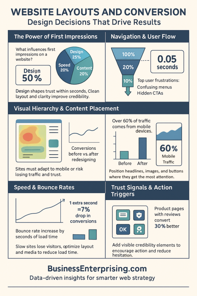
First impressions shape how people respond to your website. Visitors often decide whether to stay or leave in just a few seconds. During that brief moment, your layout does most of the talking. The design should look professional, organized, and easy to understand. If it doesn’t, people may question your credibility.
Additionally, visual structure affects how users feel about your business. A cluttered layout creates confusion and lowers trust. On the other hand, clean spacing and clear visuals help visitors feel comfortable. Therefore, you should avoid distractions and focus on guiding users toward your message.
Moreover, your design must communicate instantly. Colors, typography, and layout structure all signal quality and professionalism. Visitors tend to trust sites that look stable and modern. As a result, small design flaws can cause hesitation or second-guessing. That hesitation can hurt your ability to convert leads.
Your homepage, header, and call-to-action areas carry the most weight. These zones should be clean, clear, and aligned with your brand. Therefore, avoid adding too much text or unnecessary images. Let your layout do the work of presenting value fast.
Additionally, make sure your site feels consistent from top to bottom. Visitors notice when design elements seem out of place. That inconsistency can signal poor planning or lack of care. Trust comes from polish and purpose, not just information.
When your site looks trustworthy, people are more likely to stay, click, and buy. That’s why website layouts and conversion go hand in hand. You don’t need fancy effects. You need clarity, structure, and smart design choices.
Navigation and User Flow: Reducing Friction in the Buying Process
When someone visits your site, they expect to find what they need quickly. If your navigation feels confusing, they leave. Clear menus, simple structure, and easy-to-find pages help users stay focused. Therefore, your layout should support the steps people naturally take when buying.
Additionally, your menu should be visible and predictable. Use familiar labels and group related pages together. That way, users can move through your site without guessing. As a result, they stay engaged and feel more confident taking action.
Moreover, page hierarchy should reflect what matters most. Place key content near the top and limit unnecessary clicks. Therefore, users spend less time searching and more time making decisions. This small detail helps reduce friction and keeps the experience simple.
Your call-to-action buttons need to stand out. Additionally, they must appear in logical places, not just at the end of a page. If users don’t see a clear next step, they may stop. That interruption often leads to lost sales or missed leads.
Consistent structure across your site helps users know what to expect. Therefore, each page should follow a logical flow. Keep actions obvious and paths direct. When you make it easy, users are more likely to complete the process.
The connection between website layouts and conversion depends on reducing effort. People don’t want to figure things out. They want to move smoothly toward a purchase or signup. When your layout guides them with less friction, you get better results.
Mobile Responsiveness: Why a Mobile-Friendly Layout Is Non-Negotiable
Most people now visit websites from their phones. If your site doesn’t work well on mobile, they won’t stick around. A layout that breaks or loads slowly causes frustration. Therefore, users often leave before they even see your content.
Additionally, poor mobile design affects your search visibility. Search engines rank mobile-friendly sites higher in results. If your layout fails the mobile test, your traffic drops. As a result, fewer people find your business in the first place.
Moreover, a bad mobile experience sends the wrong message. It tells users you haven’t kept up with basic expectations. That lack of attention hurts trust and leads to lost sales. Therefore, you must test and update your layout to meet mobile standards.
Buttons should be easy to tap, and text should be readable without zooming. Additionally, pages should load fast and scroll smoothly. These details help users stay focused and move through your site without frustration.
When your layout works well on phones, you create a better experience for everyone. That includes buyers, leads, and even returning customers. Therefore, you improve your chances of converting visits into actions.
The link between website layouts and conversion is stronger on mobile than on desktop. You don’t get second chances. If users struggle on mobile, they leave fast. Keep your design simple, clean, and responsive to support mobile users from the first click.
Content Placement and Visual Hierarchy: Drawing Attention to What Sells
What users see first can shape what they do next. That’s why smart content placement is essential for getting results. If your headlines, images, and buttons appear in the wrong places, users lose focus and miss your message.
Additionally, people scan before they read. Therefore, your content should follow a clear visual order. Place the most important information at the top, where eyes naturally go. As a result, users engage faster and understand your offer without much effort.
Moreover, well-placed headlines guide attention and set expectations. They should be bold, short, and followed by helpful content. Add supporting visuals nearby to strengthen the message. Therefore, users connect with your pitch before they even scroll.
Your buttons need to stand out and appear early. Additionally, repeat them at natural stopping points. This repetition increases the chance of clicks without feeling forced. Keep your calls to action specific, visible, and consistent across pages.
Whitespace helps direct attention without distraction. It lets users breathe and makes your layout easier to scan. Therefore, don’t overload a section with too much content or clutter.
When everything flows in a clear order, users stay focused and move forward. Better content placement leads to better results. The relationship between website layouts and conversion depends on your ability to lead the eye. Show users what matters, when it matters most.

Page Load Speed and Its Impact on Bounce Rates
What users see first can shape what they do next. That’s why smart content placement is essential for getting results. If your headlines, images, and buttons appear in the wrong places, users lose focus and miss your message.
Additionally, people scan before they read. Therefore, your content should follow a clear visual order. Place the most important information at the top, where eyes naturally go. As a result, users engage faster and understand your offer without much effort.
Moreover, well-placed headlines guide attention and set expectations. They should be bold, short, and followed by helpful content. Add supporting visuals nearby to strengthen the message. Therefore, users connect with your pitch before they even scroll.
Your buttons need to stand out and appear early. Additionally, repeat them at natural stopping points. This repetition increases the chance of clicks without feeling forced. Keep your calls to action specific, visible, and consistent across pages.
Whitespace helps direct attention without distraction. It lets users breathe and makes your layout easier to scan. Therefore, don’t overload a section with too much content or clutter.
When everything flows in a clear order, users stay focused and move forward. Better content placement leads to better results. The relationship between website layouts and conversion depends on your ability to lead the eye. Show users what matters, when it matters most.
Trust Signals and Conversion Boosters: Elements That Encourage Action
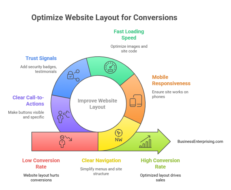
People hesitate to buy from websites they don’t trust. That hesitation can lead to missed sales and abandoned carts. Therefore, you need to build confidence early. Small details like trust badges and return policies help reduce doubt and increase action.
Additionally, visible security icons make a difference. Customers want to know their payment and personal details are safe. A lock icon or security seal near your checkout builds trust fast. As a result, users feel more comfortable completing the purchase.
Moreover, testimonials offer strong proof. When others share positive results, new visitors pay attention. Therefore, place reviews near products or pricing. This placement shows that others have bought and benefited. That feedback builds belief in what you offer.
Your return policy matters more than you think. A clear, fair policy lowers risk in the buyer’s mind. Additionally, people may purchase more if they know they can return items easily. Keep the policy easy to find and easy to read.
These simple elements support action. They remove fear and answer silent questions before a user asks. When trust feels strong, conversion follows. The connection between website layouts and conversion depends on both design and credibility.
Make trust part of your layout, not an afterthought. Therefore, use real stories, show your protections, and write clearly. Users who feel confident are more likely to act. Confidence turns visits into sales and interest into loyalty.
Conclusion
Improving your website’s layout is one of the simplest ways to boost results. Visitors judge your business quickly. Therefore, how your site looks and works makes a difference. Good design builds trust. Poor design pushes people away before they even learn what you offer.
Additionally, layout affects more than appearance. It shapes user behavior from the first click to the final checkout. Headlines, buttons, and menus all influence how visitors interact. When elements are easy to find and follow, users feel confident. That confidence leads to more action.
Moreover, small layout issues can slow your site or confuse your visitors. Both problems raise bounce rates and lower sales. Therefore, you should test for clarity, speed, and mobile responsiveness. Each improvement helps users stay focused and engaged longer.
Your layout should support what you want users to do. Add trust signals and clear calls to action. Additionally, remove anything that causes friction or delay. Simple, direct design choices usually work best.
When you combine good structure with smart content, people stay longer and do more. The connection between website layouts and conversion is strong. Every change you make should guide users forward, not distract or confuse them.
Think of your site as a salesperson. Therefore, give it the tools to work effectively. Small changes in design often lead to big results. Focus on clarity, trust, and flow. That’s how you turn visits into value.